Daylight Studios launches its new brand identity and website

Reaching the milestone of our 25th anniversary has brought new features and surprises for our company. This Monday we are proud to present our new brand identity, a project that has been developed by Madrid-based communication agency Cocus, who has created our new logo and a completely redesigned website.
Daylight Studios was born 25 years ago and has been constantly growing ever since. As a result of our staff´s closeness, dedication, reliability and efficiency, we have become a reference for the photographic industry in Madrid. We want to start this new phase with a brand identity change that includes new designs for both our logo and our website. This is the fourth logo change for Daylight Studios, a company that started in the business in 1990 with a spiral that was revamped six years later. It later evolved to the most recent logo (with two circles) on the occassion of the company’s 15th anniversary. The new logo enhances our carachter and symbolizes who we are today, reflecting the professionalism and experience that we have acquired over the years.
Freddy Frisuelos, Daylight Studios Managing Director, explains that the new identity “originated when we reached the 25th year milestone, because we felt that we had to close a cycle and open a new one. Our work prospects are excellent, we have a bright future ahead of us. That’s why we believed that it was necessary for us to renovate and share it with our clients. With the new logo and website we want to communicate that we are very much alive and going for another 25 years.”
The new logo has a clean and lineal stroke in stylish black and white. It’s a symbol made of hexahedrons that represents the studio’s blueprint with volume, distinguishing its different spaces, including a connection that was made between two of the studios years ago.
New website: www.daylightstudios.com
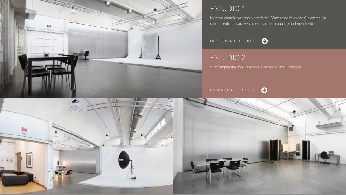
Users will find Daylight’s new website more visual. It has been designed following the latest technological advances, with more accesible, organized and intuitive multimedia content. The design also uses clear ochre colors that convey a sense of calmness and freshness. The digital platform was created with a responsive web design in a manner that allows webpages to be viewed in response to the size of the device one is viewing with (computers, smartphones and tablets).

